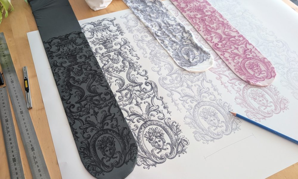
Before a new design becomes a real product, there is actually quite a lot more to it than just designing the pattern. Normally this doesn’t matter at all to the people buying the tights, but maybe there are some people who are interested of these details.
Often months pass between the times I sit down to design new tights, because I’m mostly occupied with the daily tasks of running the business and fulfilling orders (and managing my family). But during this period I collect ideas and materials, so when I finally sit down to design, I already have a list of possible new designs.
I rarely create full new collections anymore, mostly adding new items to the existing ones, or creating new individual pieces to get feedback and check if people like the idea of that design or not. If a “standalone” new pair of tights is successful, I create a new collection from it by adding 3–5 more designs to it.
Depending on the design, I create it 100% by myself or I use works of others for some parts. For the latter, I absolutely like using old illustrations as a base for my designs, which makes it much easier because I don’t have to create the whole image from scratch. Why design something that was already designed and is free to use? Or at least you can use it as inspiration without being accused of plagiarism.
There are literally thousands of old illustrations that we designers can use in our work because these images belong to the public domain. This is a legal term and means that people can use these works as they want, even for business purposes.
But having the opportunity to use other people’s work does not always make it easier, because often it is a long process to find the right materials, and the time spent browsing online catalogs for images for hours can take the same amount of time as actually just designing the whole thing.
So I usually use old illustrations when I have already saved them for later during earlier research for another product, or when I feel that I don’t have the knowledge to design the item myself (like I don’t have the botanical, anatomical, architectural, etc. knowledge to create the actual illustration), or when the illustration/image is so beautiful or has such a specific style that I want to use it.
Research for existing tights
Because my tights are not mass-produced but have a lot of handwork in them, they are more expensive, so people mostly buy them when they fall in love with them, or they need them for some event and they can’t find anything similar for cheaper. So it’s really important to see if there are any similar products on the market to my idea for a new product, to avoid designing something that people can buy for $5 at any webshop.
This research means that most Virivee tights are niche products (or were at the time when they were designed).
When I see that I can’t find something very similar, or I think that the idea would still be worth designing, I start the process.
Research for inspiration
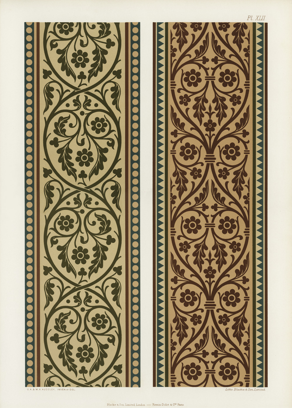
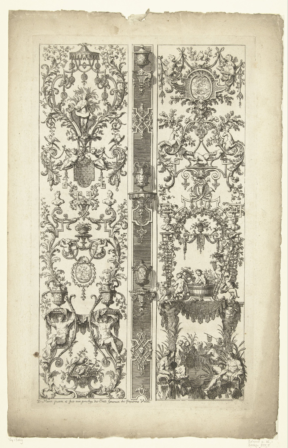
At the moment I already have 142 saved images in my “ornament ideas” folder that I collected over the last 5 years, and when I want to create a new ornament or lolita tights design, I go through the files and start looking at them.
Here are four totally random images to show how they look in their original form:
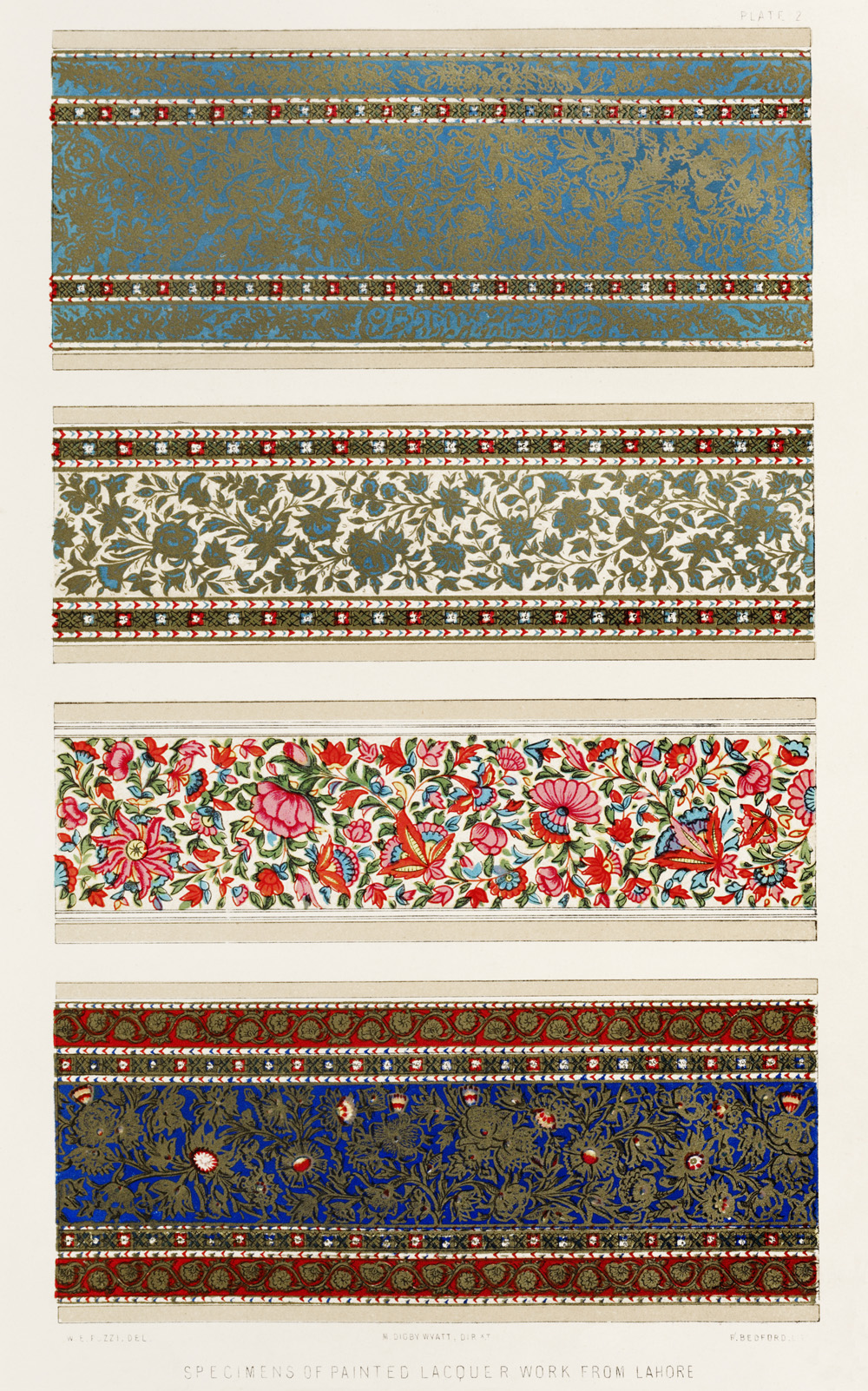
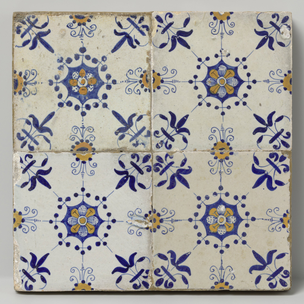
Besides ornaments, I also have folders for flowers (sorted by colours in different folders), trees, animals, skulls, mushrooms, moths, butterflies, angels, crosses, sea animals, witches, landscapes, statues, winter, summer, horoscopes, humans, death illustrations, etc.
But when I have no saved files for reference, or find none that would fit, and I don’t want to create the illustration by myself (because I can’t, or because it would take much more time), I have to go and do research for public domain material.
Some people would create AI images here, and it is an option, and in some cases they might work for tights design, but I prefer not to use it. I will write a separate post about using AI in my designs and my take on it, but not in this article.
My favourite place for old artwork is the Dutch Rijksmuseum’s website, where almost all of the images are available in high resolution and free to use in any form. People only need a login and they can download the images. The search filters help to narrow down the results. I like to use centuries and techniques, like 18th–19th century + etching is my go-to combination for illustrations.
For botanical illustrations I go to the Rawpixel stock image site, which made the work of collecting a lot of old botanical illustrations easier, cleared them and made them available to download for free in high resolution.
The National Gallery of Art (Washington) also has more than 60k images available for download as public domain images.
The Met Museum is also a great place to search for public domain images.
The Art Institute of Chicago is another place to download them from.
The British Library Flickr site offers a lot of public domain images. The only problem with these is that it’s very difficult to search through them. Don’t use the official British Library website search: the images there are not in the public domain, because the Library owns the copyright of the photos and didn’t release those to the public.
And there are fortunately a lot of places to check for images.
(Sidenote: always check the terms of the page where you download the images and the status of the actual image to make sure it is indeed free to use.)
The material and the printing techniques matter
Before I start designing, I have to decide what material I want to see the new design on. Will it be sheer, semi-opaque, or opaque tights? Because different materials need slightly different designs. The same is true for the printing technique.
It’s possible to print on sheer (thin) and also on semi-opaque or opaque tights, but the print will look different on these materials because the skin that shows through the material mixes into the visual result. So the same print that is strong, vivid and sharp on an opaque material will be faded, hardly visible on sheer tights.
Or when I want to use a gold foil for the new pattern, I have to know that the foil will not stretch as much as the tights themselves, so I have to make “stretching gaps” in the design, like here on these ornament tights I designed in 2016. The first photo shows the product, and the other image shows a close-up of the ornament design. You can see that none of the elements are connected to each other, so the material between the gold foil pieces can stretch without damaging the pattern itself when the tights are worn. This is especially important with plus size tights, where the material might stretch much more than with smaller sizes.
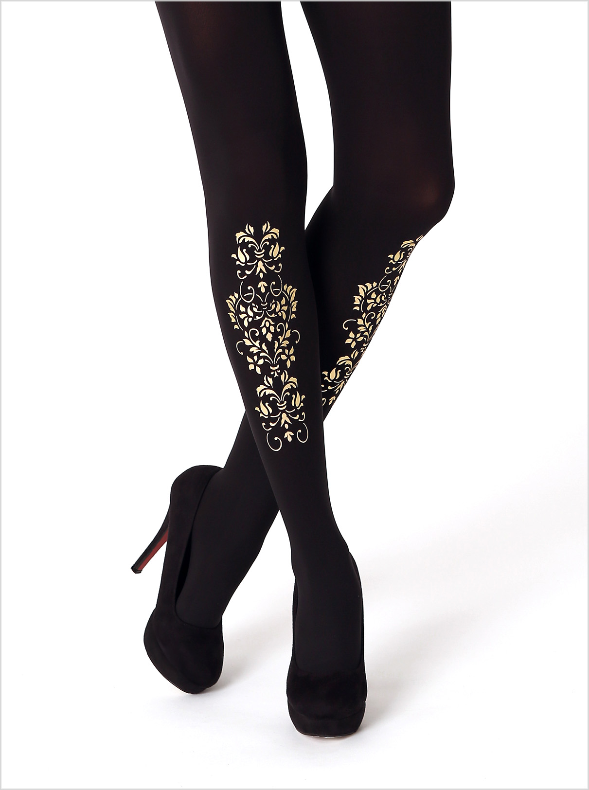
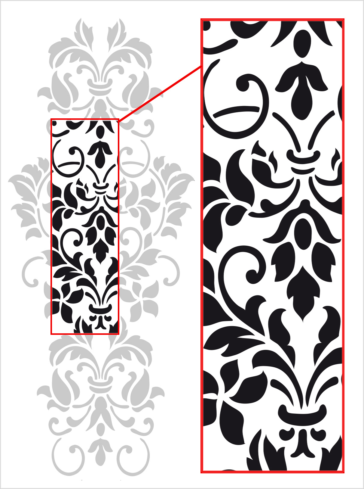
But if the print is not a foil but a screen print or a sublimation print, then I don’t need these stretching gaps, and the design can be different. And there are lots of other things to take into consideration.
The actual design process starts here
Sometimes the original public domain file I use is almost ready and there is not much to do with it apart from cleaning the image (redrawing it), fitting it to the tights size, adjusting the colours and getting it ready for the sample print.
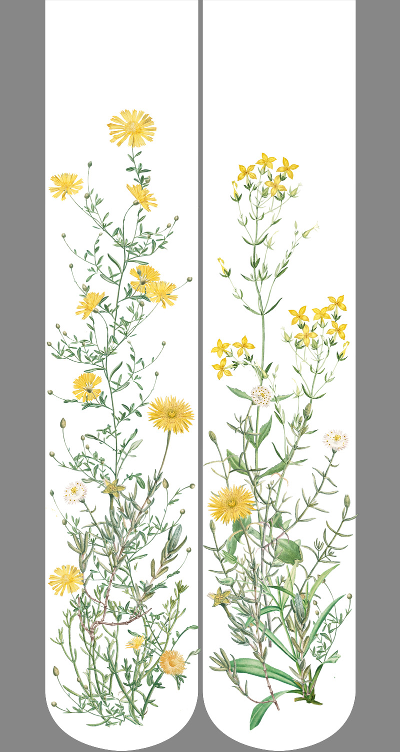
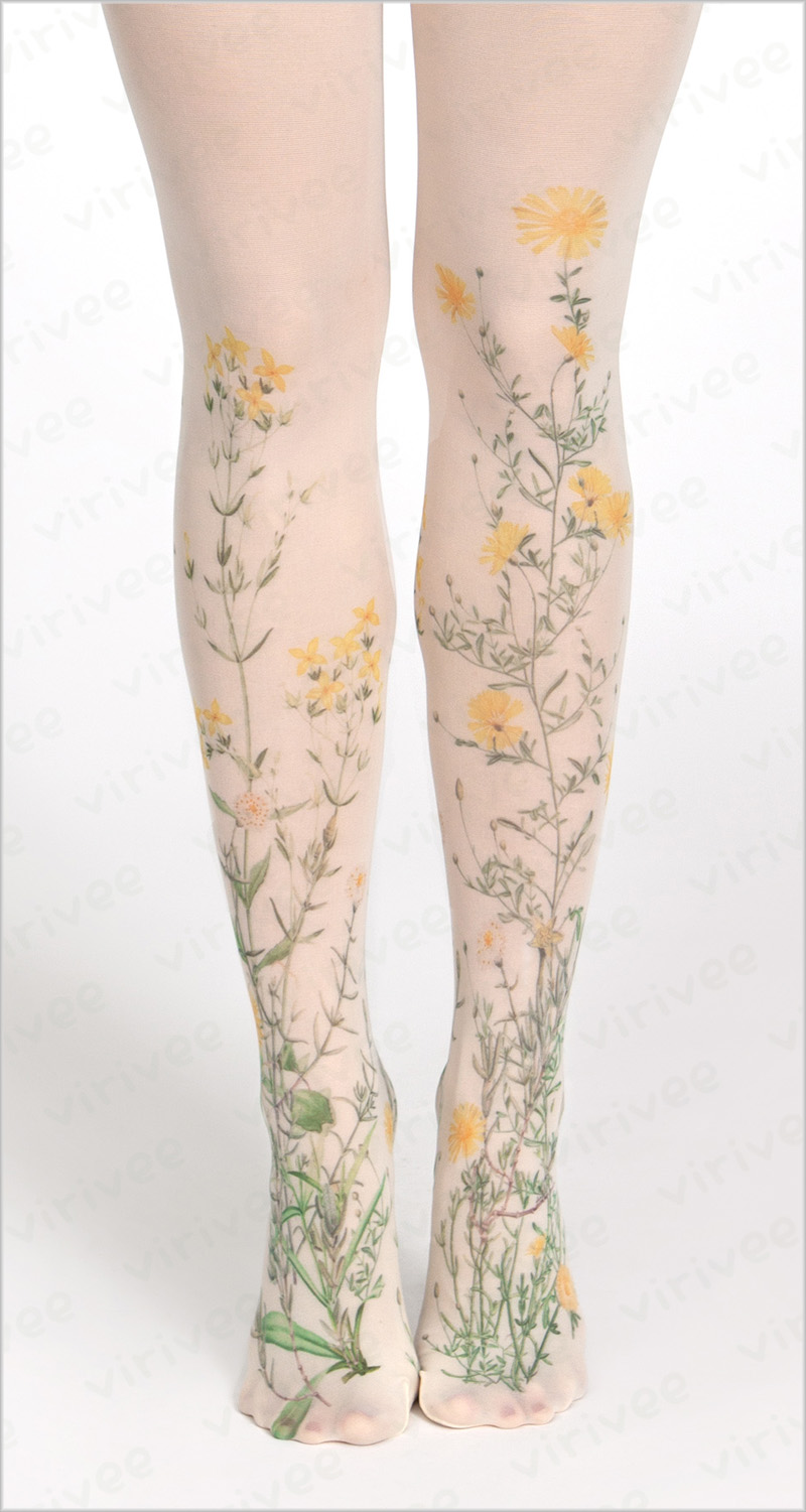
Other times I use 5–10 illustrations to create a new design (like with the Meadow Tights).
Then there is the case where the original is mostly just an inspiration or a draft for the final design because it needs to be changed so much, or I want to use only a small part of the original artwork.
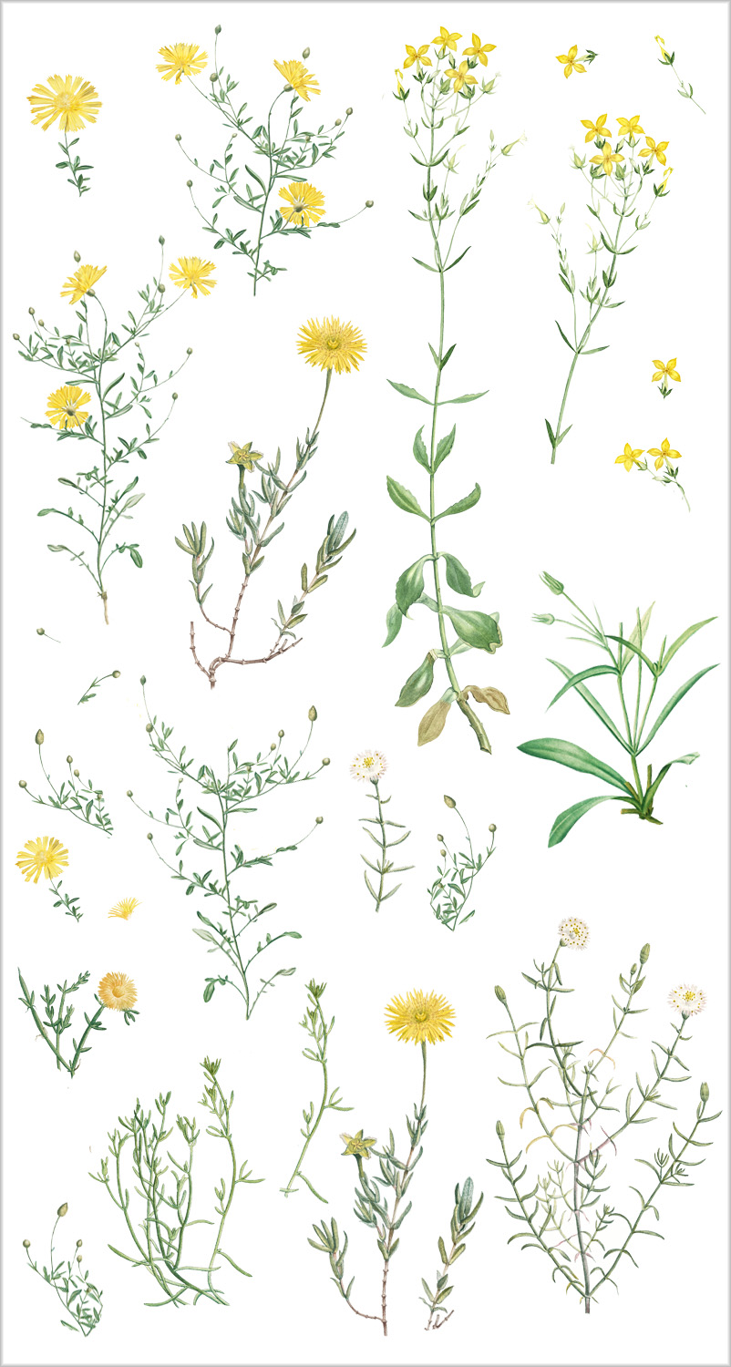
Here are all the floral details I used to create the Yellow meadow tights. All of them are original botanic illustrations of Pierre-Joseph Redouté from the 18-19th century:
Fine-tuning the design
Because the tights are “flat printed” (laid flat and printed on the front, then the back), when designing the pattern I also have to be aware of how the printed sides of the tights will look when the tights are worn and the front and the back are both visible on the sides of the legs.
But even when the image is ready, it usually still takes a lot of work to adjust the colours (if it is not a black print), especially because the final print on the tights usually looks different than on the design.
Often the design looks good on the computer, but on the tights the elements appear too large or mismatched, and the design needs to be adjusted again.
It happens that this “fine-tuning” takes more time than the actual design process.
When the design is a custom design for a customer, the process is a little different: at every step I send the customer a draft of the design, and I only continue to the next step once they have approved it.
I often work in parallel on multiple designs, so I’m not just starting and finishing one design, but starting with one, abandoning it for a while for other drafts, then coming back to the earlier one after a few days, then leaving it again after modifying it for some time, and it starts again. This gives me a clear head to see the design objectively.
But sometimes I get in the flow with a design and finish it in one sitting, but this is rare because many times a new tights design can take up to 10–15 hours of work. (Sure, sometimes it’s just an hour and I’m questioning myself why I didn’t do it earlier.)
And when everything is ready, the sample is finally printed and I take a few photos to show potential customers, it can still happen that they just don’t like it. 🤷♀️
Other Articles
How I became a tights designer